Aimco Aparment Homes
how might we...
improve the overall design of the website while meeting user needs and bussines goals?
Responsibilities
Researching, create low fidelity and high fidelity wireframes, create prototypes, presenting to stakeholders, and problem solving better solutions to meet the demands of executives and our Senior VP.
Problem
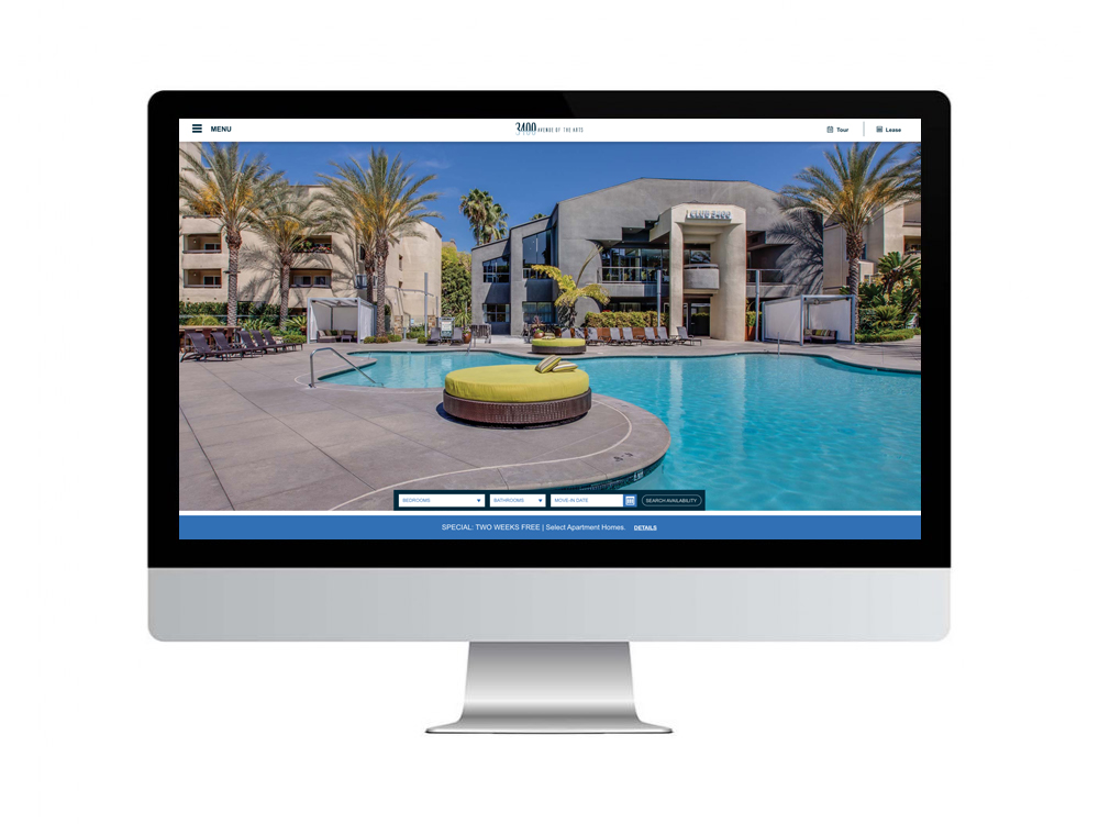
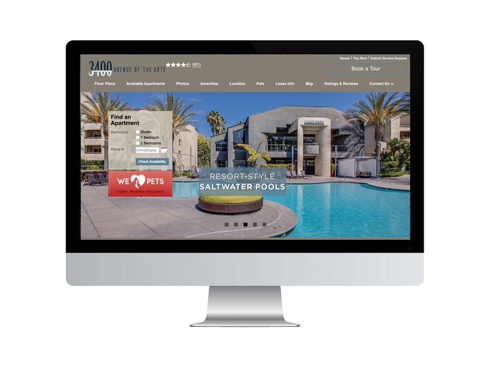
Aimco Apartment Homes website utilizes a template for over 60% of their properties. The same template is used for both high end market rate properties as well as affordable or income qualified properties and was designed in 2008, only having minor upgrades since. My goal as the designer was to find out what the end user needed, what the business goals were, and what data we previously had gathered and maintained. I focused on creating a clean, simple design that would help guide the user to exactly what they were looking for while pinpointing where the company wanted them focused.
Research
According to the data from the current design, there were certain pages barely being utilized. Users found it confusing that the navigation contained numerous links that all eventually ended up at the same place. These users wanted instead to focus on the culture and the apartment itself though photography and video.
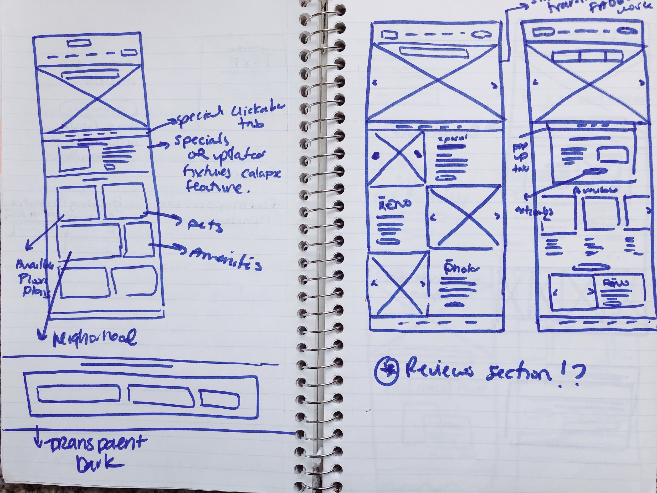
UX Audit
- The navigation contained too many links overall and multiple links directing users to the same page.
- The navigation felt busy and overly cluttered.
- There was not enough padding between elements such as: logo, copy, and navigational links.
- The homepage is cluttered with text, specials, and a filter bar.
- The business goals were not being met.
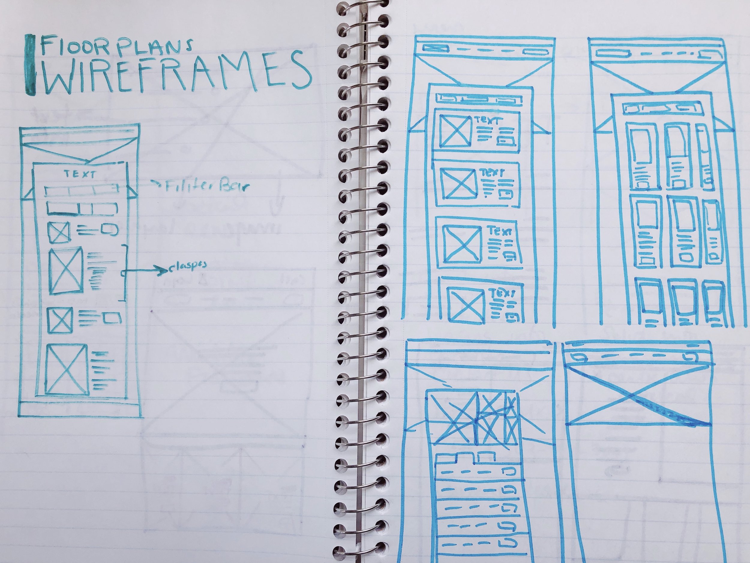
- There was not clear hierarchy on certain pages. For example: the floor plans page.
- There was unnecessary information throughout pages that was not being utilized according to the data.
For example: the floor plans page and complementary sidebar information.
Business Goals
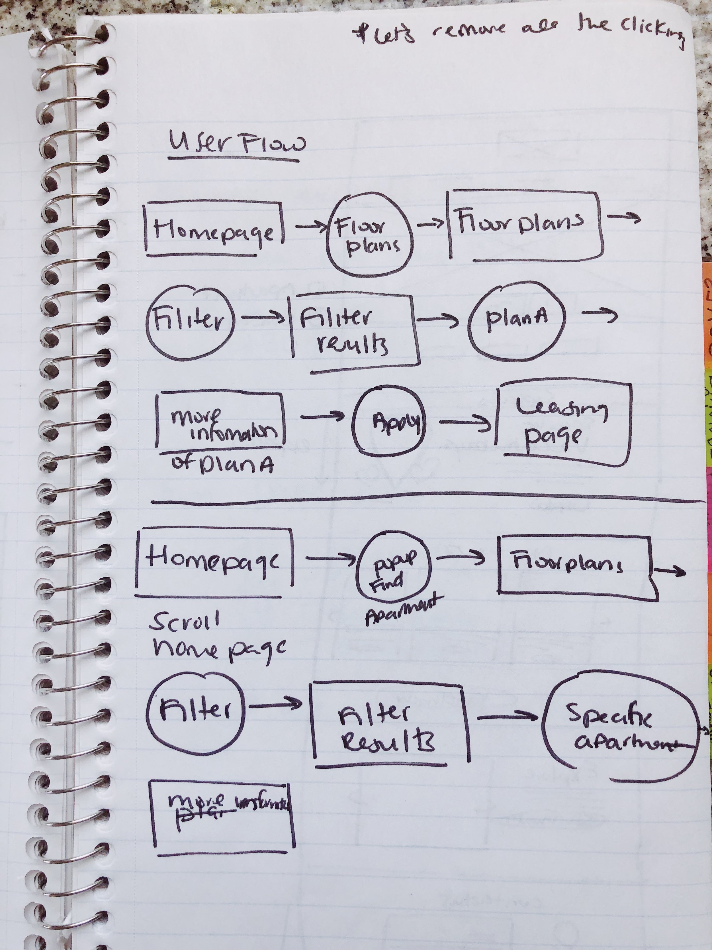
One of the main business goals was focusing on how to get future residents to sign leases multiple months in advance. Through requests from stakeholders and upper management, I was asked to prioritize within my design directing people to the properties leasing page quickly and efficiently upon visiting the site. Another request to implement into my design was to utilize and have users focused on the amazing photography library of properties.
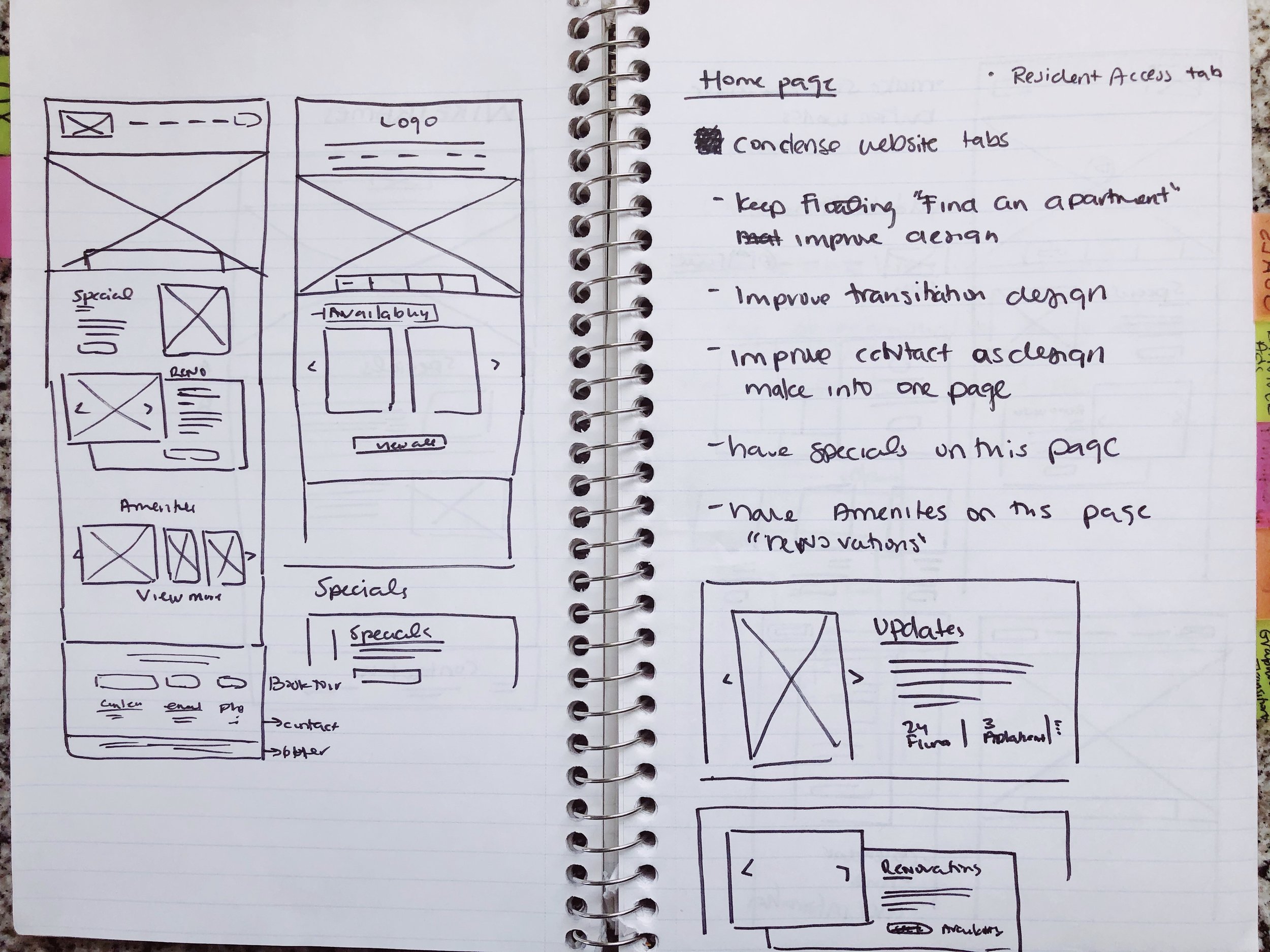
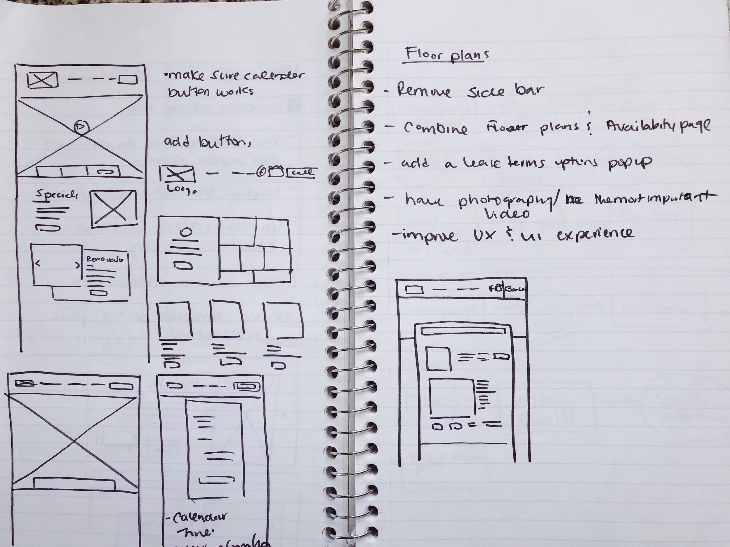
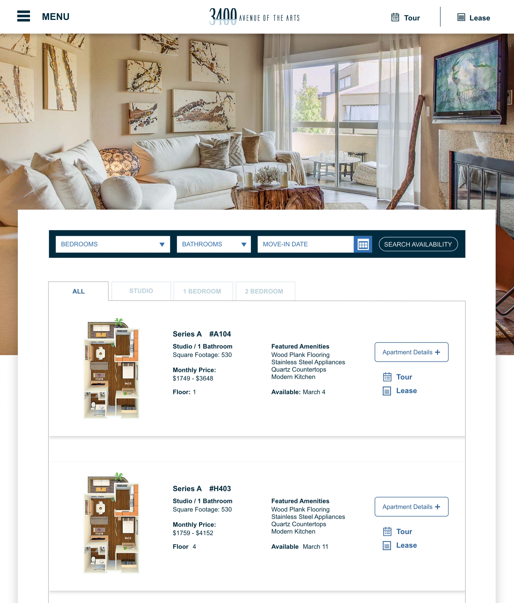
Floor Plans Page - Desktop
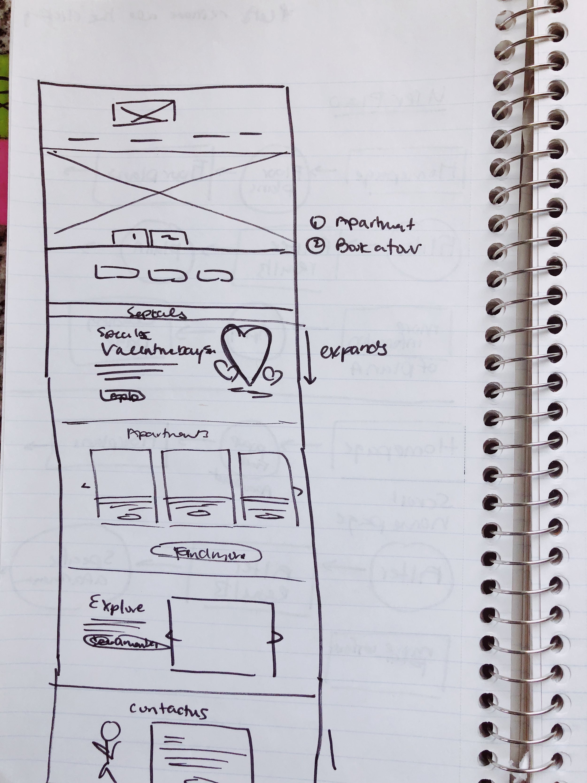
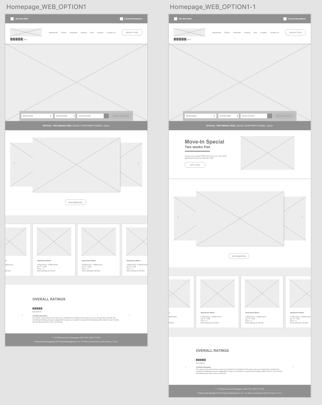
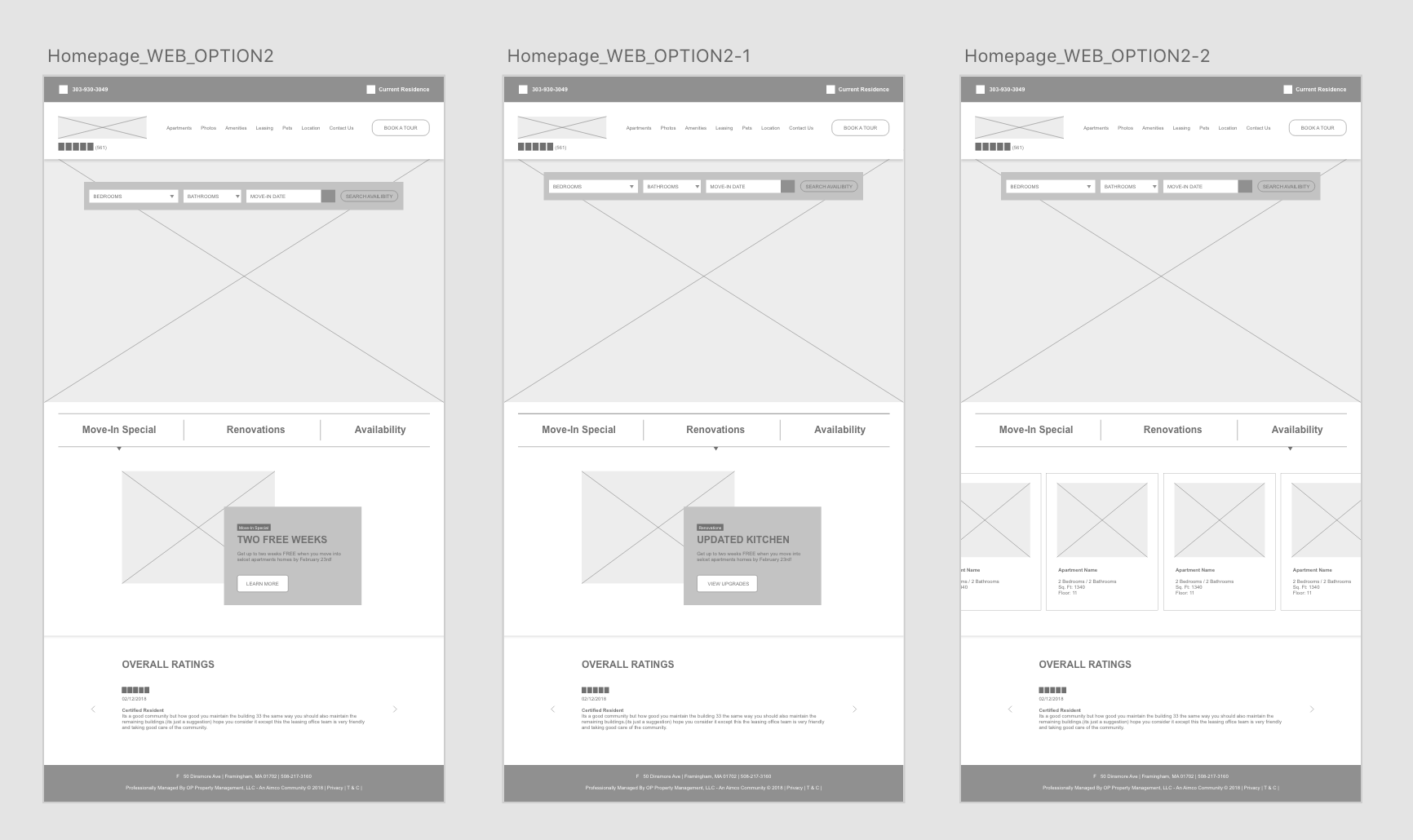
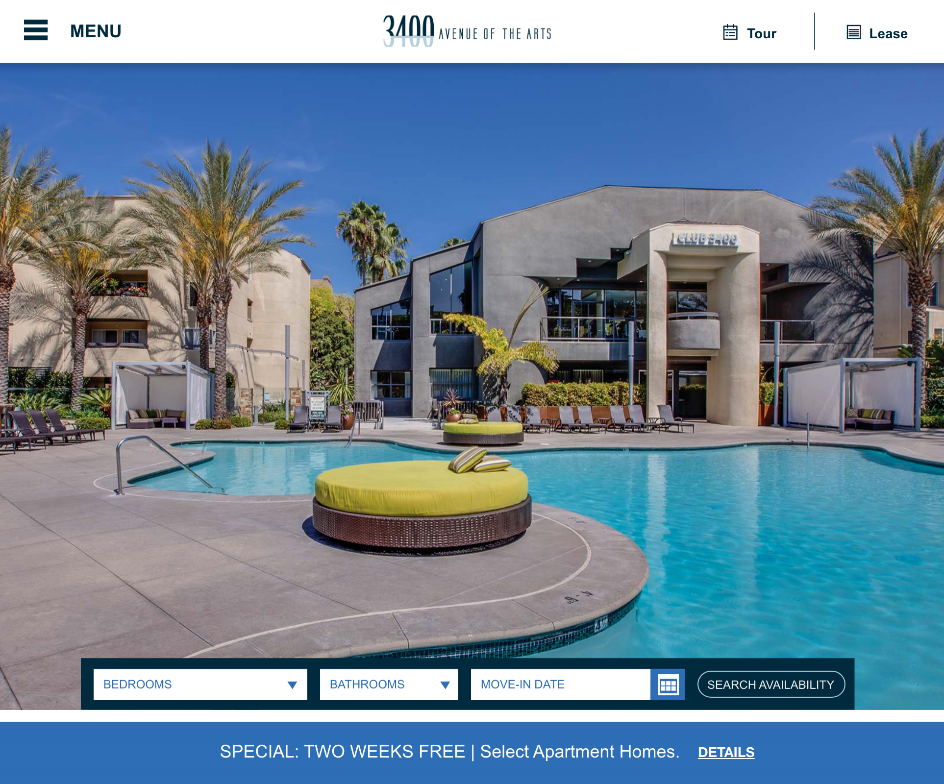
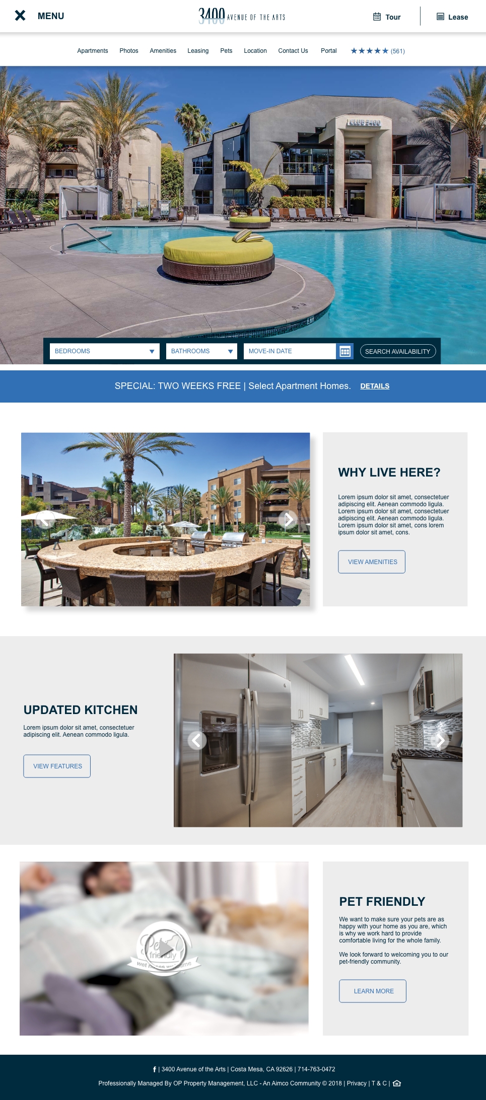
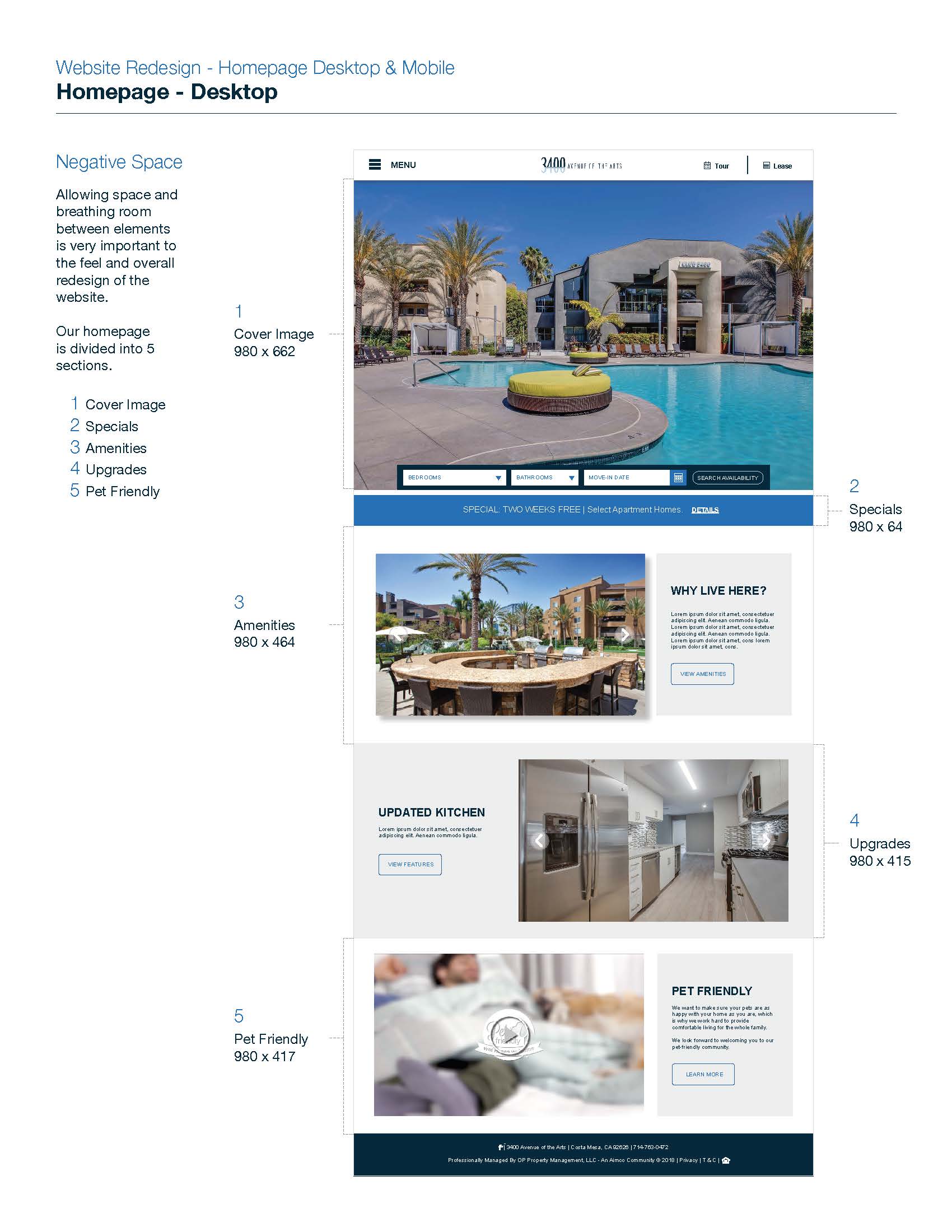
Home Page - Desktop
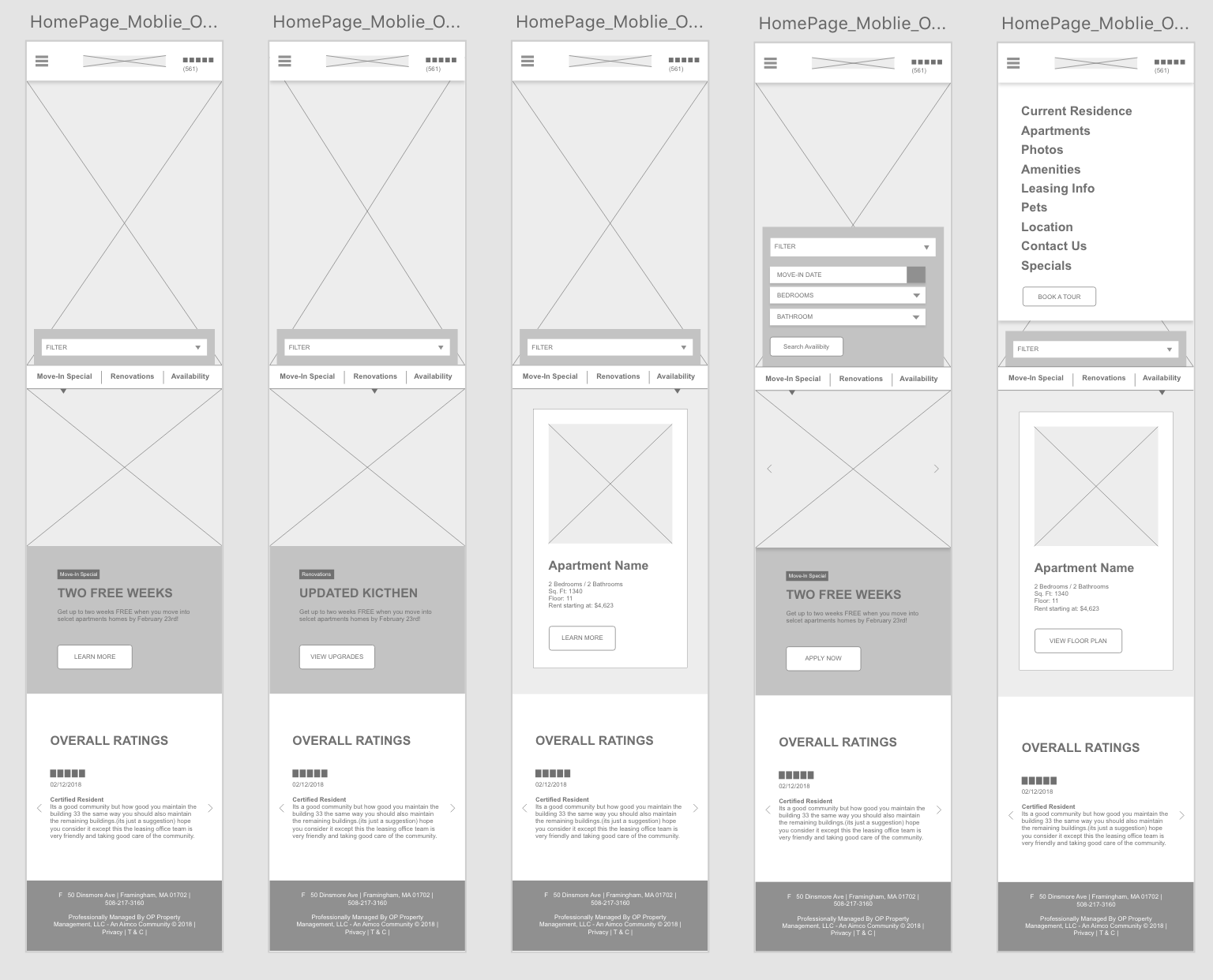
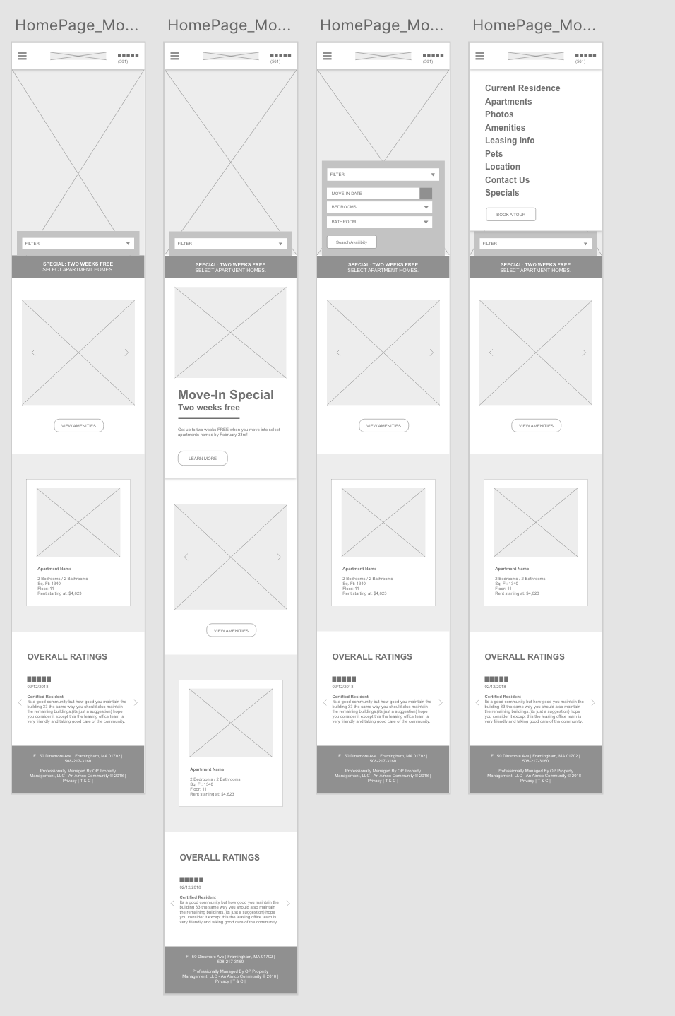
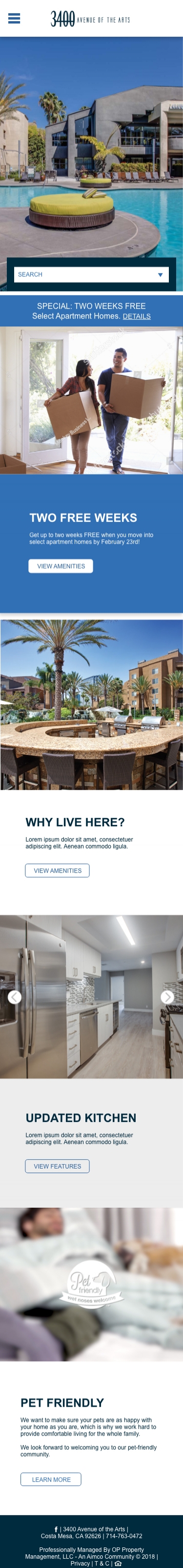
Home Page - mobile
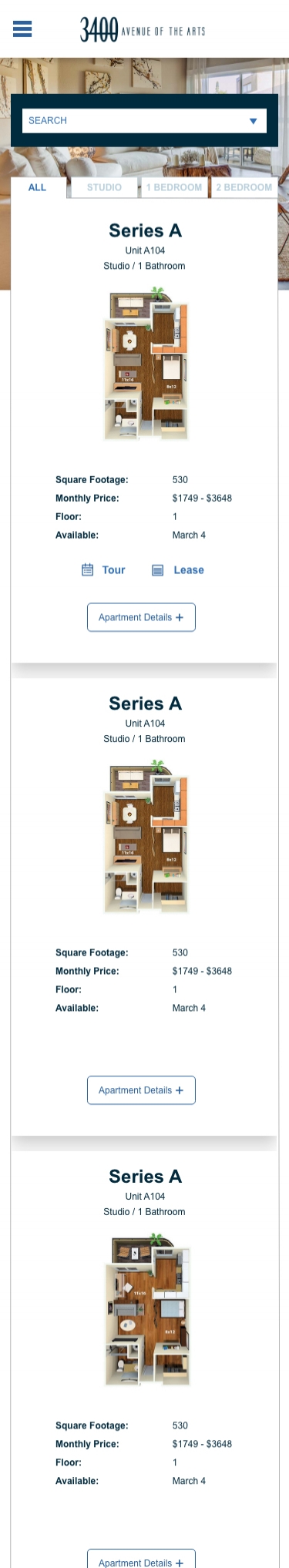
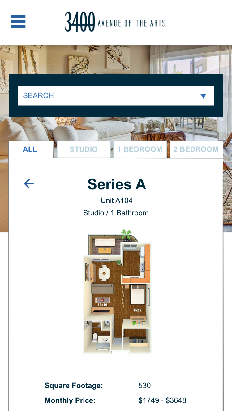
Floor Plans Page - Mobile
Same password. :)
The Solution
Based on the feedback received from the current website data, the business goals, and the needs of current and future residents, I designed everything to be intentional and have purpose. By focusing on creating negative space within the content in order to allow breathing room, I used storytelling to help future residents visualize themselves with a life in one of the apartments. I used consistency with typography, CTA buttons and icons. Created hierarchy within each page, and subtly highlighted information that both users and the company deem important. Lastly, I focused on designing ways to keep people on the same page. This was especially important for the floor plan pages where the desire was to have users continue to view more options if they didn’t immediately find what they were looking for. I was able to do this by creating a variety of interactive dropdown menus that allowed for users to view more information, as well as giving the company the ability to track this information all while keeping the website design clean and legible.

What’s Next?
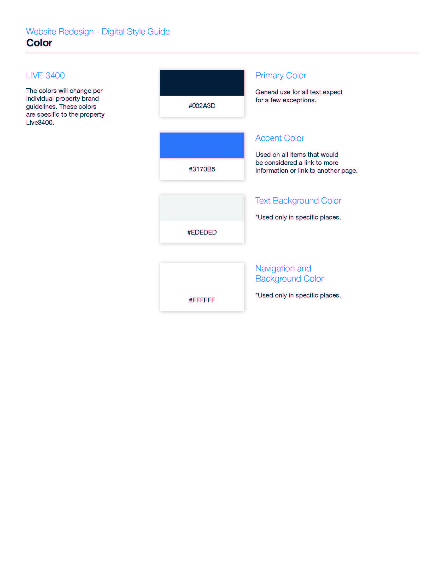
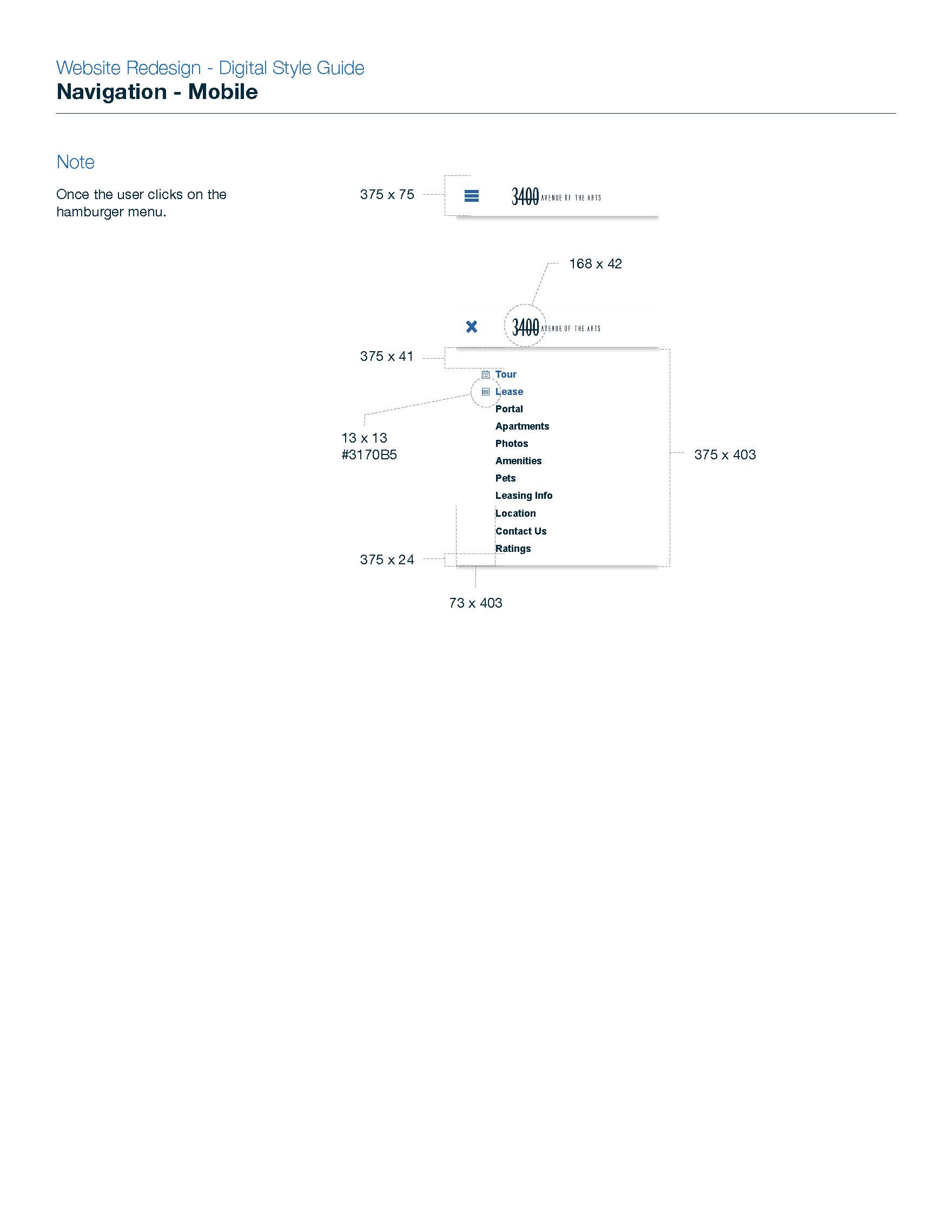
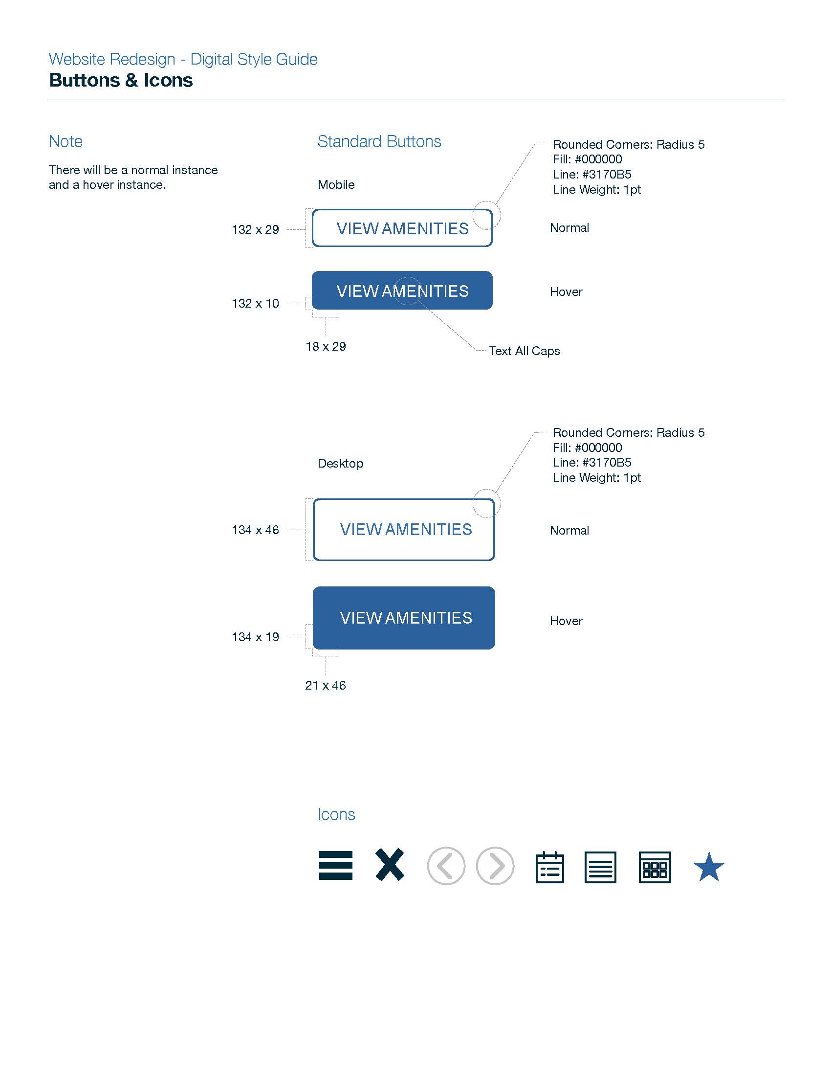
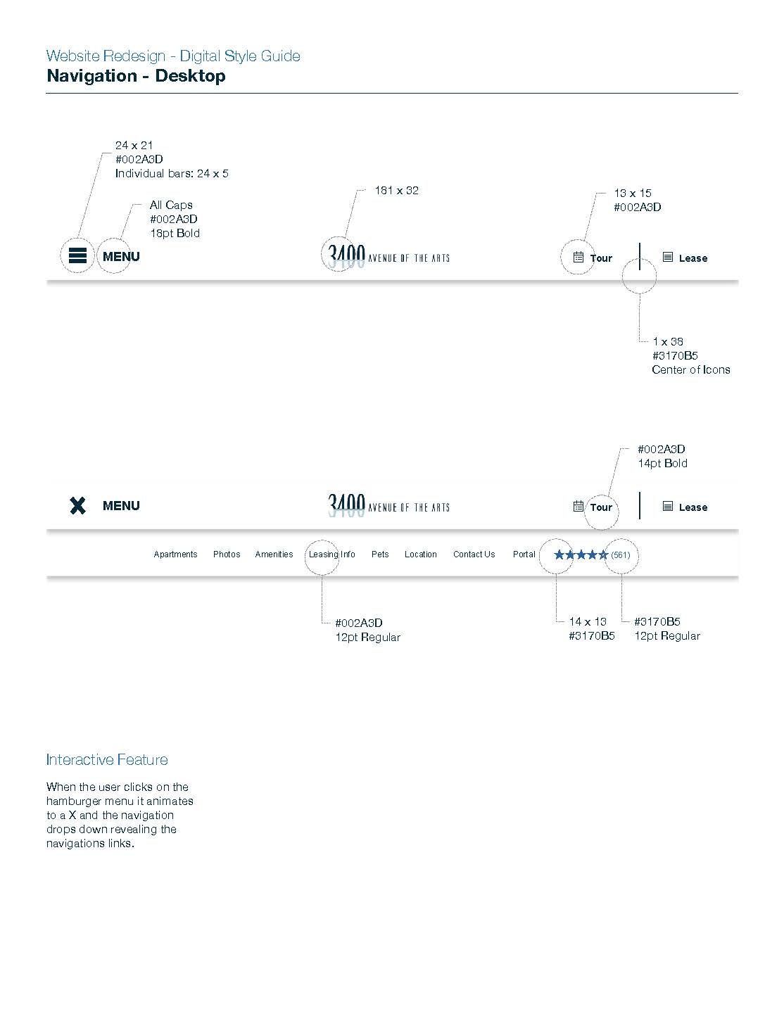
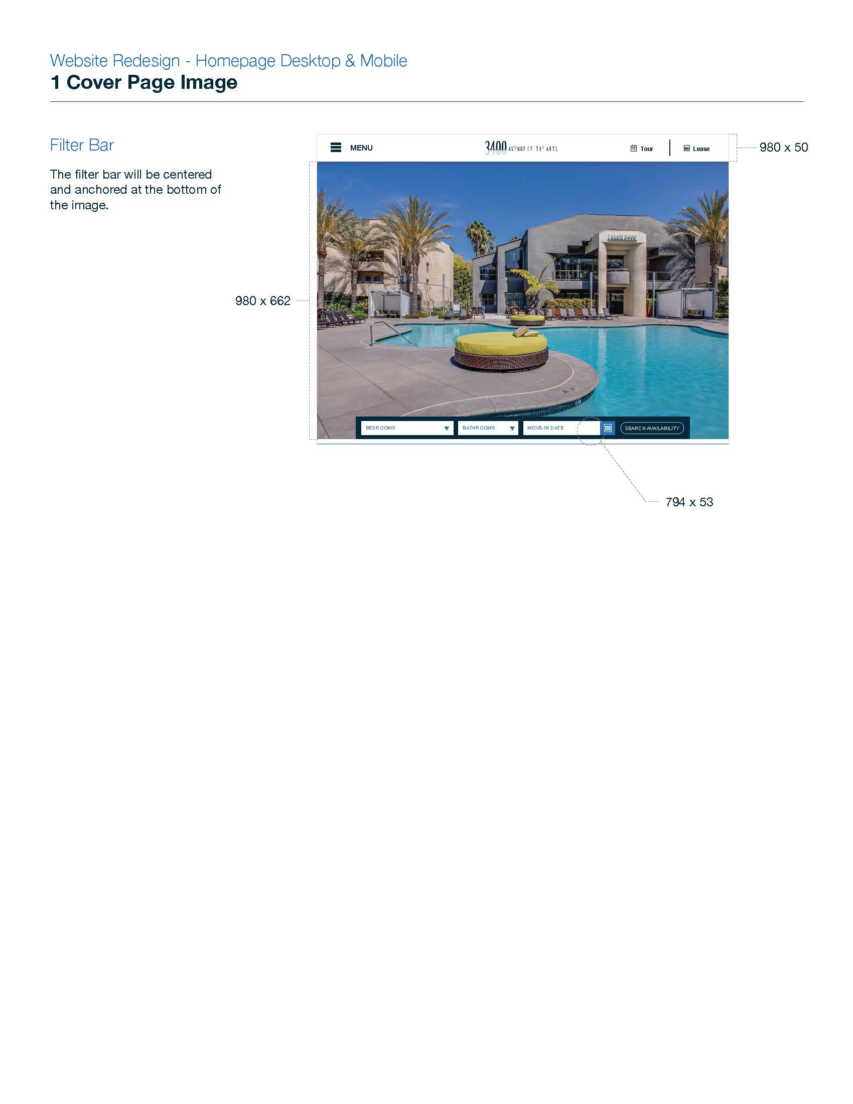
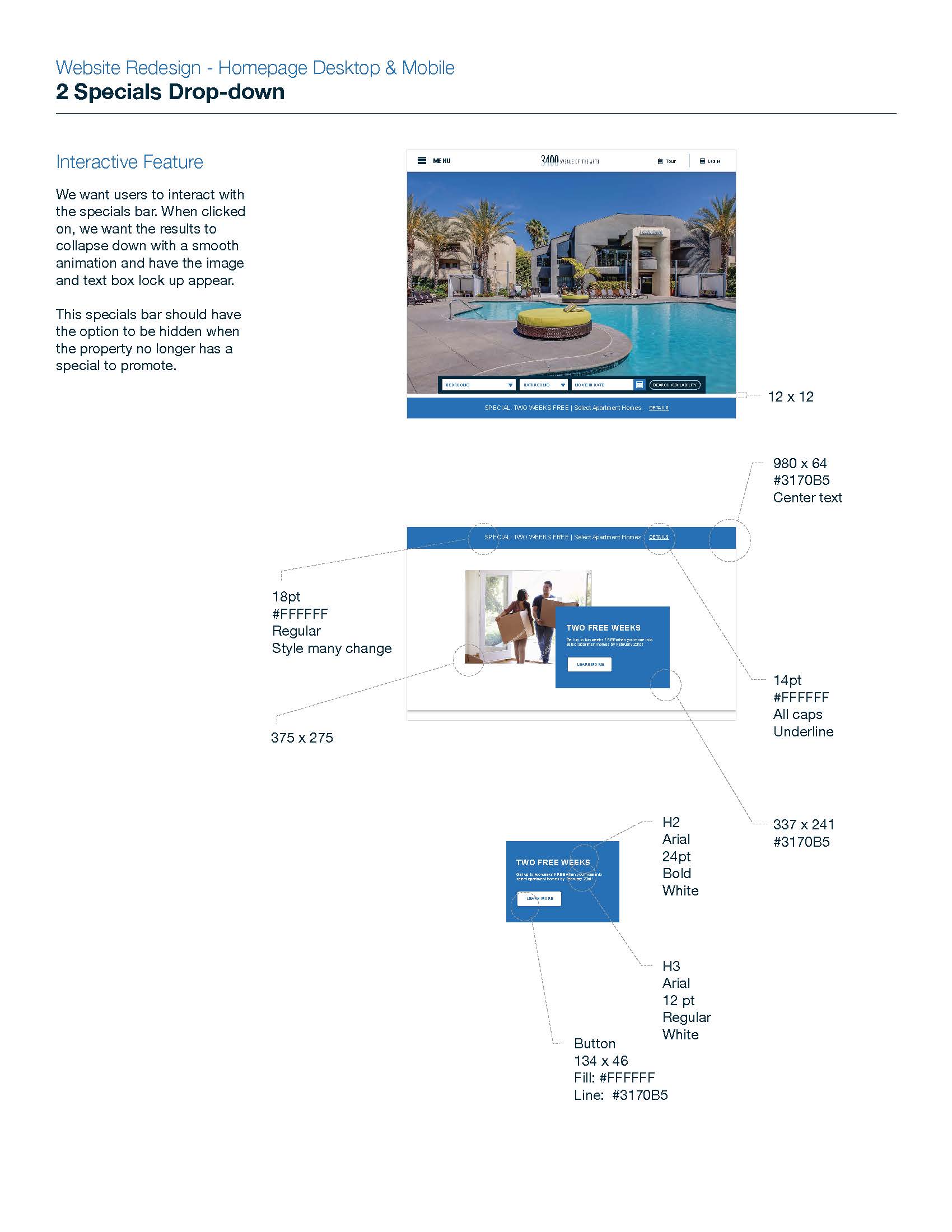
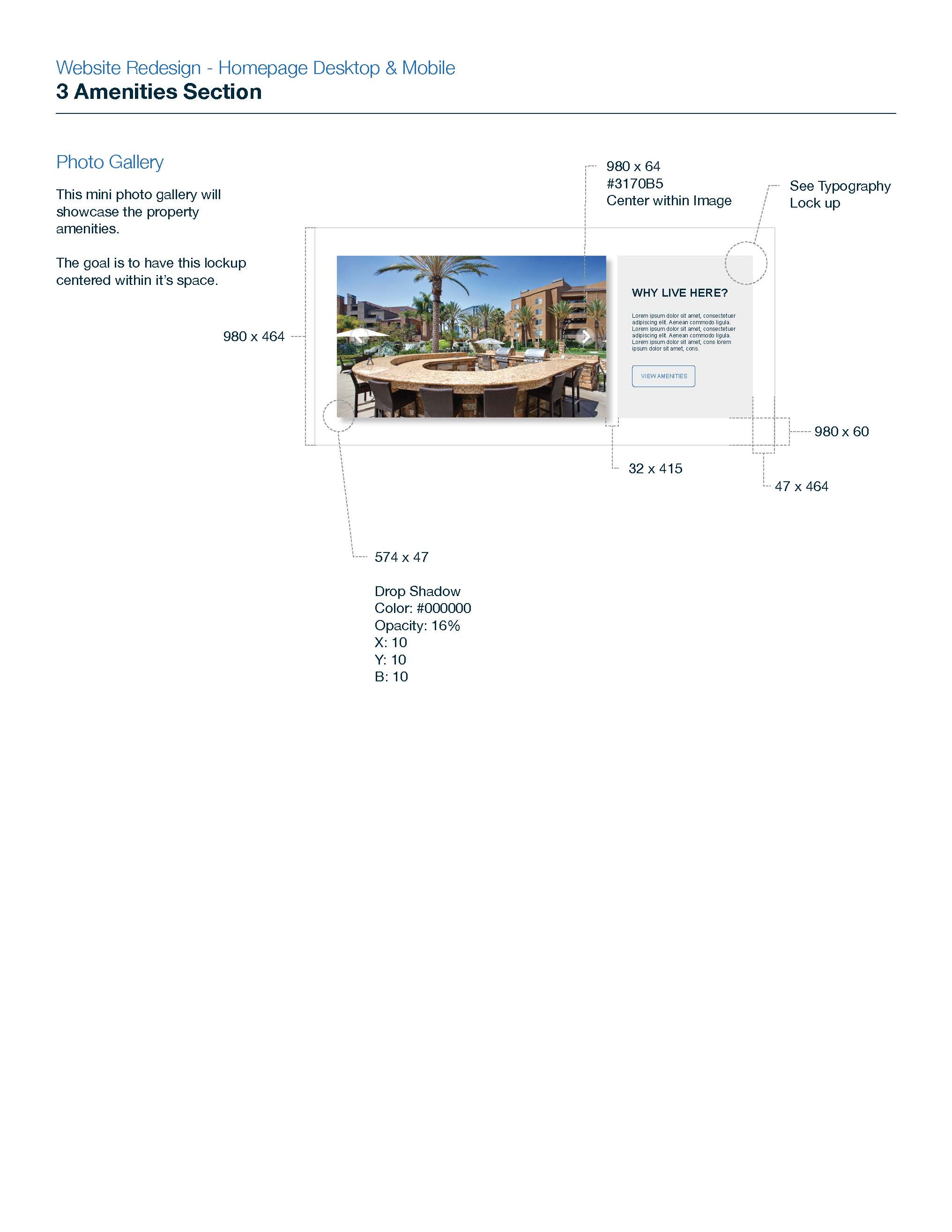
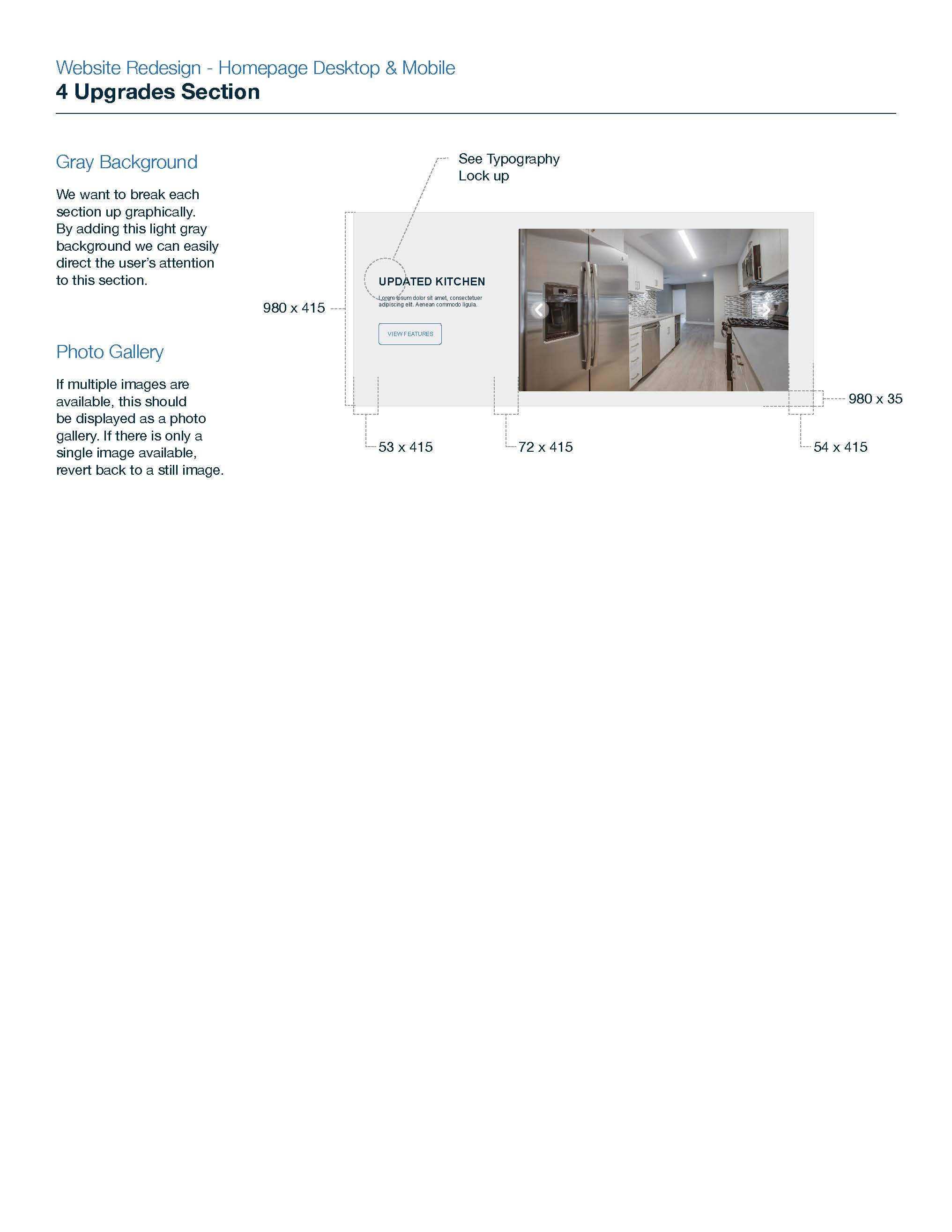
The designs will be handed over to the development team. Unfortunately, the development team does not use Adobe products and the budget constrained that I only used what was accessible to me (Adobe products). My next steps are to make the transition between designer and developer as smooth as possible by creating redlines for the developers to follow. These will include typography, colors, padding size, images, and interactivity for both desktop and mobile versions. Even though the goal is to have a responsive page, the hope is these redlines will be used by the developers to gain a better understanding of design intent. I will continue to provide any assistance to the development team by answering questions or helping to problem solve solutions to issues that may come up as certain aspects of the design are not able to be implemented in the way they are envisioned.